Saturday, November 28, 2020

Week #8 - Diana Herrera – Obsession Lurks Within… But Make It Pop!

 Obsession is the state of being obsessed with something or someone. It is also an idea that constantly comes up in someone’s mind. Obsession is like two different sides of a coin. There might be positive and negative side to it, although, the bottom line is that this feeling can be downright unhealthy all together. 


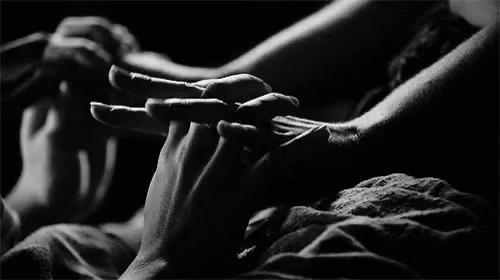
Obsession can have different connotations, positive and negative. Someone can have an obsession with food which is safe to fall under the category of a positive obsession. A good example for a negative obsession would be someone becoming obsessed with another person. The actions influenced by obsession can lead to harassment or invasion of privacy. For this case, lighting would best interpret this word by using angles that reflect that paranoia from the person being obsessed over. For example, I might use diagonal back angles of light with tinty colors to truly reflect that stark creepiness and alertness. I tie this to the obsession of a stalker. A person walking home late at night suddenly is found by a stalker in a lonely street or dark alley. In order to create that paranoia, we might see a silhouette of the stalker rather than their well-lit face and body. We can see this play out in the movie The Shining. When the man becomes obsessed with trying to kill his family, the lighting in the fil becomes colder and more shadows are seen as referenced in the images below. Another term for obsession can also be addiction. An addiction to drugs, and addiction to constantly checking up on your partner is another example. 


In terms of positive obsession, for example a television show, food, band, or flowers, I see lights playing with the word in a playful pungent manner by making bolder choices in color and loudness in the design. This connection is made from the example of Hello Kitty. Hello Kitty merchandise has a lot of pink. If a person were to be obsessed with this brand, you would see plenty of pink in their world. An obsession for Christmas, we might see an overwhelming amount of Christmas lights and decorations as seen in the picture provided below from the time I went to see people’s Christmas lawn decorations last year.  People’s commitment to set up a full display of lights in their lawns shows a clear obsession for the holiday.


Overall, this term provides a lot of versions for interpretation with lighting as long as the lighting gives a sense of overwhelmingness and lack of control. With this being said, I’d love to play with this word in my lighting designs in the near future. 

Friday, November 27, 2020

Week 8-Jackie Gonzalez-"Why you so obsessed with me?"

Obsession. Yes, you can categorize Mariah Carey's "Obsessed" in this topic if you really wanted to. When I think obsession I immediately think of eyes. It's not the most original idea, but it is what comes to mind first. When somebody is obsessed with something they do not look away from their obsession or sometimes, they are very aware of how frequently they are staring that they conceal their eyes, possibly with some sunglasses, a hoodie, or even a tilted hand. 

Additionally, all their thoughts wrap around their obsession so tightly that every one of their thoughts becomes about that subject. This happens to also be the second definition of Obsession, "An idea or though that continually preoccupies or intrudes on a person's mind". 

Whenever I do a special eye makeup look I take a closeup photo of my eyes. I turned this photo into a black and white shot and now upon closer observation, looks like I am giving a secret side eye look. Like I said in the beginning, one of the looks of obsession is attempting to not be so obvious when staring at the subject of the obsession to the point where you find alternatives to try not to look directly at the subject. Side glances come into play. In this photo, you can still see my eye however, the darker shadows near my inner corner and around the close perimeter of my eye conceal my side glance like I am hiding in a dim corner of the room, scoping my subject while not being too obvious. 

I am nothing compared to the legendary filmmaker Alfred Hitchcock, but my photo reminds me of this shot of one of Hitchcock's famous films "Vertigo". In this scene, Scottie is hired to follow and watch over Madeline, who he later becomes very romantically obsessed with. The audience can clearly see Scottie through the silver between the door and wall, but there is still a good amount of shadow and darkness being cast around him except for his fixated expression.  

There's a certain kind of shadow special created for these moments. You are trying to balance between concealing the obsessor, yet trying to highlight that too focused look they have on their face. When I think about turning this into a gesture of lighting, I think of one person staged behind another. A bright front light on the most down stage person, while the person downstage has a long, rectangular cut light on one side of their body that is highlighting one of their eyes all the way down to their foot as if they are standing in a door way, watching the unsuspecting person without the door way having to be there. 

While I was writing the previous paragraph, I realized that this incredible film taught me an example of how to symbolize obsession through colorful lighting. It's very subtle at first and can be built up to be overwhelming, and it's great if you don't want to use the black and white or shadowy composition usually associated with obsession. Please excuse me if this is starting to sound like a film break down, I just LOVE Vertigo so much and it fits so well with this week's subject. 

Color can be used to symbolize the aura of a person, and when the color is used frequently around a subject, that color will be associated with that subject. For example, the emerald green color that follows Madeline throughout Vertigo up until she falls off of the mission tower. By that point Scottie is utterly obsessed with her and cannot bare the idea of living without her. We do not see Madeline's emerald color until we meet Judy, who looks exactly like her and is forcibly turned into Madeline, the emerald green lighting and color returns in full force. With that being said, color can act like a reoccurring thought; once the color is associated with the subject of obsession, it can be used to remind us of the subject when they are not there. 


(Above: Madeline is the only wearing the eye catching Emerald green in a full restaurant) 

(Above: Judy fully transformed into Madeline)


Week 8 - Jacqueline Malenke - There Are Two Sides to Every Obsession

Obsession is an idea or thought that continually preoccupies or intrudes on a person's mind. I feel that obsession has two sides to it: a wonderfully positive side and an intensely negative side. The positive side of obsession feels really bright, wide, and has an endless amount of colorful light. It is the type of obsession that brings intense joy and happiness, and it feels light and weightless in a way. I imagine the positive side of obsession to look similar to a large, bright blue sky. The possibilities are endless, you are surrounded by gorgeous color possibilities, and it feels as if there is always room to take more of the obsession in. 

On the other side of the spectrum, obsession can feel like a very sharp and pinpointed feeling. It is overwhelming and suffocating in a way. The obsessive thought is constantly circling someone's mind, and it feels as if there is no escape. To me, being overly obsessed with something can make you feel braindead, and the only thought your dead brain can conjure up is that single obsessive thought. I felt this photo represented the negative side to obsession really well. 


Overall, I feel that obsession really has its value within a person's life, but it is really easy to get lost within those obsessive thoughts. Again, it feels as if it is light vs dark, open and wide vs cramped and pinpointed. As long as you stay within the healthy side of obsession, a person can have a satisfied and balanced life. 

Sunday, November 22, 2020

Week 7 - Diana Herrera - Writing Loyal Cantons of Contemned Love

Shakespearean theatre does go back to tradition roles in theatre of non-diverse casting, which can leave a bad taste in some people’s mouths when they hear that name, but in current times, I’ve seen more diversity within the roles. In summer 2019, I was able to see Twelfth Night in the park. This production truly stood out from my expectations. They cast was diverse but did cause some confusion for some audience’s understanding of the story. Overall, I do see this work being more adapted to fit representation. 


Shakespeare is all about poetry and the art of it. I had the opportunity to take a Shakespeare acting class in order to understand the text and methods behind the text and style of acting. I discovered that there are so many layers within the words and if you look past the confusing phrases you can begin to understand the meaning of the poetry. It becomes a dance of poetry.

In this picture below, I see light playing with this willow tree in a very poetic manner. The warm sunlight kisses each leaf as the tree sways through the wind. We can see the tree become the center piece. There is something poetic about the way the light hits the tree. 


Another place my mind tends to go to when I hear Shakespeare is textures, patterns, and rustic tones including copper, green, red, blues. As a lighting designer it is my job to play on that poetry and help carry the story along the words. Within Shakespeare’s themes, there are mystery, comedy, deceit, romance and many other themes of his plays. There is so much to play with in terms of styles for lighting and the poetry of it just another tool to use. For example, Twelfth Night is a very quirky play. 


“Make me a willow cabin at your gate,

And call upon my soul within the house;

Write loyal cantons of contemned love,

And sing them loud even in the dead of night;

Halloo your name to the reverberate hills,

And make the babbling gossip of the air

Cry out ‘Olivia!’ O, you should not rest

Between the elements of air and earth,

But you should pity me…”– Twelfth Night


 Lighting can help sell this quirkiness by having more color and light on stage. Whereas in Hamlet and Macbeth, these plays are darker, mysterious, and dramatic, so you would see more shadows playing on stage. I also believe there is something organic yet proper about Shakespeare. Overall, I believe this classical form of theatre gives a wide variety of themes to play with in terms of lighting and that is what I love about it and my goal as the designer is to help the audience understand the story and not fall asleep if it the their first time experiencing Shakespeare! 


WEEK 7- Jackie Gonzalez-ALL THAT GLISTENS IS NOT GOLD, Y'ALL!

This week's post might be a little all over the place, please bare with me as I delve into my weird relationship with Shakespeare as well as what I think it means to be a designer, sort of. 


I cannot check off the "Obsessed with Shakespeare" box on my theatre kid card, in fact I like to stay away from Shakespeare all together. I have grown a bit tired of hearing the same things over and over to the point that it has become an echo chamber before you finish saying the playwright's name. The closest "Shakespearean" photo I have is of myself and my theatre buddies at my last community college, trying on costumes in the costume closet on the last day of instruction. It was really fun, and my friend Deisy, tried on a very cool Shakespearean coat/top costume piece. 


On the contrary to the photos above, I have never worked on a Shakespeare production, so I do not have any photos of anything related to this topic. Although, I can point you to one of the most interesting productions of 
Twelfth Night which is the one that the National Theatre in the UK put on. The National Theatre used post a new play every Tuesday during the first part of quarantine which was amazing! I only got to see an hour of this play before I had to go on and work on an essay that took me a heck of a long time to write. The designers went bezerk with the design of this play and I think it all looks so cool! The stage rotated clockwise and the set was a cross section of a pyramid. There was also a small pool hidden beneath the floor boards. The scenic designer in me is flabbergasted, and the second photo revealing the very high and angled, lighting positions above astounds me. Here are some quick photos I got on the internet. 


Now, back to the main event of this post. I recently found out that one of my favorite quotes actually comes from a line in William Shakespeare's The Merchant of Venice. That being said, I then realized that this play is one of Shakespeare's problematic works, which is not great, and I wanted to recognize that. 


The quote "All that glistens is not gold", also known as the classic version of "All that glitters is not gold" is one that is important to me. It reminds us that something that looks to be perfect, and makes our eyes glitter so much to the point where we want it, is not always what turns out to be. There have been a numerous amount of times where I thought that once I had something that I really wanted did not end up fixing all of my problems. Everything stayed the same or got hilariously worse. It's false gold, don't be fooled. As a design student who has never been a lead design position, I hold it against myself as well as my abilities. It disappoints my ticking time bomb of a career timeline in my head. I guess, in my mind, that having a fancy job title is something that I think will be a chance to prove that I belong and that I am not a phony who merely thinks that she knows design. When I talk about this with my family, they bring up that I have to stop with this weird, stressful timeline I have engrained in my head, and that I have to take a step back and really think about what will make me happy and allow me to feel successful/that I have made it. 

When I break down this expectation to its simple terms, the thought that all will be fixed if I got a lead position, does not make sense. It brings me back to, "All that glistens is not gold" and it is selfish to only think about myself while in a lead design position because design is such a collaborative process and true designers cannot think about JUST themselves and/or their plans only. In reality, everything is alright and I am happy to help out with production in any way. When we take away these titles, it is all comes down to the exchange and execution of ideas that ends up getting warped and put in a hierarchy. The title is not gold, the real 24 karat magic that I want is working in design in any way that I can whether that be just helping out with painting, swapping out gels, shopping for props, or being a second pair of eyes to catch something the designer did not see, etc. 


This blog is a wild ride, but I hope it makes sense. 


Week 7 - Jacqueline Malenke - Moving On From the Bard

I have a bit of a love/hate relationship with William Shakespeare. On the one hand, his works are a classic and integral part of theatre and theatre making. However, on the other, it seems that most of his plays have incredibly dated values ranging from intense sexism to blatant racism. I get that it is the sign of the times, but it is incredibly disappointing that some directors and producers try to "maintain the history" when producing a Shakespearean play.

Hamlet has a soft spot in my heart specifically. It was fall 2011, and I had just been accepted to UC Riverside for their general theatre program. I was too anxious to actually audition for one of the two productions holding auditions at the time, so I decided to sign up for a crew position. I ended up being assigned as the spotlight operator, and my life was completely changed. The lighting designer of the production was Ben Tusher (a UCI alum!), and he really was the first person to introduce me to the lighting world. Below is a photo from the production. 

My second and final Shakespearean acting experience was in a production of The Tempest also produced by UC Riverside. This production was the epitome of disappointment in that the director wanted to "honor the production as it was written". This means that she had only cast one female person in the single female role of the production, and all of the other parts were cast as men with the exception of the Boatswains. She then added "spirits" into the production to help with the magical world we were creating. This meant that for the first scene, I was a Boatswain, and the rest of the production I dawned a robe and flitted around the stage doing absolutely nothing. As you can see in the photo below, my job for this production was to watch Miranda and Ferdinand play chess. 


Shakespeare isn't all bad. I love the quote from Act 2, Scene 7 of As You Like It that says, "All the world's a stage and all the men and women merely players. They have their exits and their entrances; And one man in his time plays many parts." I quite agree with this sentiment, that we are all playing parts (not necessarily in a negative way). However, we do have different masks or facades we put on for different groups of people. This quote also shows that life in it of itself is incredibly theatrical. 

I know that theatre will never kill off William Shakespeare and his works, but I do hope that the theatre community as a whole starts to cast and create these productions with a 2020 lens. I want to see black bodies, transgender/non-binary bodies, and female bodies in these roles created for white men! I want to see the diversity in the world be brought to life through a Shakespeare play.  

Sunday, November 15, 2020

WEEK 6-JACKIE GONZALEZ-THE STUDY OF FEELING SORROW

 I have been feeling sorrow more often this quarter since there is a lot of stress on me right now and I keep messing up and feeling a larger sense of guilt than before which is not the best for my mind, but I cannot help it. My brain is full and tired. Sorrow is caused by loss, affliction, disappointment, or regret, it is an intenser feeling then sadness since sorrow can be prolonged, mixed in with a sense of resignation from the world around you. Naturally, a gloomy storm comes to mind, mild shadow, or a simple softened black and white photo. The world has lost its color, its uniqueness, and becomes one thing; sorrowful.


My past scenic professor and mentor at my community college, Aubree Lynn, taught my class an interesting designer drawing exercise. She assigned us to just draw a messy portrait every week in order for us to understand and study shadows; not caring about any minute details. When I was first assigned to do one of those drawings I kind of lost it because I love to do detailed drawings and paintings. It was out of my comfort zone, but I did it them anyway, especially because this scenic class was graded. I began to study shadows; I took any sort of room and broke it down to its basic form of light and dark. I did one of these drawings for this blog post with a softened graphite pencil, took one look at it and felt a bit of ache in my heart. The thick scribbles visualize distress and the shadows almost showcase the intensity that sorrow can grow to, the darkest one on the left being the somber, almost doleful. 


Along with shadow I want to showcase, a continuous storm or rain, showing that a rainbow and Clear skies won't be out any time soon. The condensation texture going on here is descending, which leads the eye downward. Even the subject is looking down which makes this hurtful emotion even stronger. Furthermore, the texture is bigger than the subject which adds to that prolonged or larger sense of woe, like the life he once knew is melting slowly into blobs in different degrees of gray. Overall, this photo makes me want to cry, and there is a sense of relatability because I believe that everyone has been sorrowful at some point in their lives, everything is not always 100% and these works of art can connect us in human ways and is another way to say "You are not alone". 


Saturday, November 14, 2020

Week 6 - Jacqueline Malenke - The Vacuum

The official definition of sorrow is a feeling of deep distress caused by loss, disappointment, or other misfortune suffered by oneself or others. For me, sorrow feels like a deep, heavy pit within my stomach, and it almost feels like that pit is a vacuum sucking out all of the air from my lungs. Sorrow makes me feel as if I am suffocating. I am not much of an artist, but I tried to draw what I felt sorrow looked like. 


I think, ultimately, that sorrow is really the difference between light vs dark. The light side of the drawing represents life, joy, and being content. The dark represents depression, suffocation, and isolation. Sorrow can be such an overpowering feeling because of the weight of the darkness. As you can see by the torn paper in my drawing, there is also a bit a frustration and anger within sorrow. It almost feels as if that darkness is creeping into and starting to overpower the light. 


Sorrow by DanielSpr on DeviantArt

The best photo that represents how I believe sorrow can make someone feel is above. It looks as if she is drowning under water and there is thin ice or glass preventing her from coming up for air. To be quite honest, I know the feeling of sorrow and depression all too well, and I try really hard to move through these emotions as quickly as possible. It is far too easy to get stuck within that darkness and suffocation. 

As many others do, I like to use art as a way to help move through my sorrow. My go-to for achieving catharsis used to be dance. I am honestly trying to figure out how to achieve catharsis through lighting design. I think the most difficult thing is the availability of lighting design, especially now when everything is shut down. My brain is telling me that it isn't that easy to create a lighting design outside of a theatre. I suppose there is photography and filmmaking, but I don't feel I know enough to actually achieve catharsis through those mediums. 

I mostly enjoy lighting design for the escapism. I can create the feeling of deep sorrow and isolation with lighting far easier than I can draw it. What is even better, is I do not have to sit in the sorrow that I created with lighting. I can just keep moving through it.

Friday, November 13, 2020

Week 6 - Diana Herrera - Gravity and the Black Hole

 Sorrow is the feeling of deep distress causes by loss, disappointment, or other misfortune suffered by oneself or others. It is a feeling like no other. You feel it burden you to the core. It sits deep in your stomach and heart making it unbearable to breathe or move. You feel paralyzed. You look into the distance and wonder if this is what dying feels like. I’ve felt sorrow before. You sit and wonder if it will ever get better. It feels like the end of the world. With every breath you take, you feel as if a piece of you dies a little shriveling away with the wind. When you are lost in your deep dark hole of sorrow, you tend to think you are the only one to have ever experienced this retched feeling from hell. As an artist, I believe my job is to help people understand that they are not the only ones to feel this way. Unfortunately, it is a valid feeling all humans beings and animals experience at one point in their lives. 


I believe as an artist I am able to relate to this week’s topic from personal matters. By having that credibility of knowledge as to how sorrow feels, it helps add onto my tools of creativity for my work. When it comes to portraying sorrow in my art, I have an understanding on what my goal is. Talking in terms of visuality, I believe that sorrow is grey and blurry. When I think of the word “sorrow”, I see grey tones, shadows, darkness, starkness as well as blurs. When I experienced sorrow, everything in my surroundings felt like a blur. The sounds became inaudible. My sense of touch went numb. It felt as if I had fallen into a deep lonely hole of despair being crushed by gravity where no one, or anything in that matter, could save me from. 


My drawings reflect how I feel sorrow in my heart and mind: as a blurry jumbled crushing mess. There is this dark void in the center of all that blur and numbness where all other feels are lost in, sort of like a black hole as you seen in the drawing on the right. You can feel this overwhelming feeling of despair crushing you down and you are left unable to move or cry for help, as seen in my drawing on the left. Still, that blurriness and anguish kill you bit by bit becoming one of many silent killers. 


Sunday, November 8, 2020

Week 5 - Jacqueline Malenke - This is NOT a smut post

I understand that when someone says sensual, their first instinct is to talk of sexual pleasure (I mean, same), but there is so much more to the word than just sex. Personally, I find that simple things like the smell of bread, the way a room is lit, and receiving a good back rub can be sensual. Sensuality is all about your senses being gratified and that satisfaction is felt in a physical way within the body. 

Love Sensual GIF - Love Sensual HoldingHands - Discover & Share GIFs

Aside from physical pleasure, I really relate sensuality to food. I have always been a huge food lover. I love to cook, bake, and eat, and all of those things (especially the eating part) bring me physical satisfaction. Cooking the food tantalizes four of the five senses: touch, hearing, smell, and sight. Once the food that was cooked gets to be eaten, all five senses are at work bringing gratification to the eater. I think the greatest example of food being sensual is in the movie Ratatouille. Remy the rat is squandering around looking for food when he finds a piece of cheese and a strawberry. First, he bites the cheese, and he has a positive reaction. Then he bites the strawberry to which he has a completely different positive reaction. Finally, he takes a bite of both together and BAM! He is in fruit and cheese heaven.


Like Remy, I always want my meals to be a journey. I get so much pleasure physically and emotionally from eating a good meal. Pictured below is a charcuterie board that I made to help lift my sad quarantine spirits after just bring laid off from a job I despised. I know everyone has a different opinion, but you cannot tell me that this cheese plate is NOT sexy! And damn, was it delicious. 


Finally, sensuality within lighting. For me, it is all about the gratification you feel when looking at something incredibly beautiful. For instance, the photo below shows an intense sunset I witnessed in Phoenix, Arizona. The colors in the sky are so extremely vibrant, and honestly, seeing this sunset was incredibly cathartic. It felt like a message that a new day is coming, and that is always a hopeful thought, isn't it? 


Along with natural lighting, sensual lighting can be created. A candle lit scene is incredibly pleasing to the eye. If you are experiencing something like this in person, it also would heighten your senses. Your sight sense would be lower in this situation because the room is so dark, so you start to rely on what you smell, see, and feel.  

 Sensual Lighting

All together, sensuality has a broad spectrum that crosses from sexual pleasure to a delicious cheese board to a beautifully candlelit room. It is all about what triggers and tantalizes the senses. 

Saturday, November 7, 2020

WEEK #5 - Diana Herrera - Sensual Colors? Oh My!

 Sensual by definition is the gratification of the sense and physical pleasure. For me as an artist, I find this sensuality in color. Color heightens my senses of touch and sight with a load of overwhelming emotions, just as much as sharp shadows and textures of light heighten my sense tactile imagination. I get this spur of deepening emotions when I see saturate colors in my surrounds, especially with colored lights. I can feel the colors on my skin. It gives me goosebumps and chills. It feels as if I am swimming in a pool of overwhelming passion for the colors my eyes consume. The heightening of senses can be equivalent to eating your favorite food with overpowering satisfying flavor, like that first bite into a taco with lime and salsa. The taste buds on my tongue quiver in pleasure.


For these reasons mentioned, I love playing and incorporating color in my lighting designs and why I become tremendously thrilled when I attend theatrical events. Bold choices like these are able to transform a simple space into a new world of imagination and feeling. Whenever the holiday season arrives, I get a kick out of having the power to transform a plain common space into a new atmosphere by using colored lighting. With a simple color palette, I am able to create a new environment in my bedroom as seen in the images provided below. Depending on the colors used in the space, my body will have different responses. For example, the warm color palette in my bedroom of rich amber, purple, and magenta provide this new level of meditation of warmth and relaxation. If I were to use warm twinkling Christmas lights in my room, the space would be transformed into a magical world making it feel like a calmer candle-lit space where calm waters can be found. Whereas if I use cool blue tones, the space will make my mind feel cold and lost in a floating cloud with nowhere to hide. Is being able to feel color considered a superpower?

Friday, November 6, 2020

Week #5 - Jackie Gonzalez -What's Sense Got to Do, Got To Do With It?

Not going to lie, but I was a bit confused on this week's blog post since I thought sensual was a one sided word only that related to sexual intention. After further review, I learned that sensual could also mean, "the condition of being pleasing or fulfilling to the senses" of which there are smell, taste, sound, sight, and touch. Listed under this second definition was an example that states, "Life can dazzle with its sensuality, its color". Furthermore, I found a quote from an interior designer's website that added the cherry on-top of the sundae, "It is design that can be smelt, heard and felt, and leaves us with a feeling of pleasure and contentment" (Source). The blog post assignment of choosing two sides of the word sensual started to make more sense. 


I researched sensual color examples to get a further idea, and I saw a a few articles on how companies use color to get you to buy things or to send a message. Additionally, I saw how color palettes in movies can show how to effectively use color to enhance story telling. In my opinion, Inside Out, the Pixar/Disney movie, is a great starter example of the relationship between psychology and color. All in all, psychology and color/how colors can affect the way we feel is something we NEED to pay attention to as designers and use it as a tool to create effective designs that engage the senses of the audience to, again, enhance story telling. 


My cousin used to have LED strip lights in her room, and each time she would open her door and the lights would be on, the color(s) that they were being displayed would spill into the hallway. One day the lights were a very saturated blue that took over half of the hallway. It was no quiet statement. I stood in the hallway for ten minutes taking it all in, I looked really weird, but this strong blue hallway made me dig into my emotions. Other than saying that blue is the color of sadness, which it is, I wanted to talk about how it is also the color is connected to the sense of stability, strength, as well as has a calming feeling to it. The way the blue is molded by the long rectangular shape of the hallway gives it structure and more of a feeling of stability as opposed to the light having nothing to guide it which would make it look formless, giving off a feeling of melancholy. Because of the color's richness in saturation, I felt hypnotized by a calming feeling while standing here. This accidental lighting design engaged with my sight and my feelings with its saturation as well as its collaboration with the structure around it. 


Next, I wanted to discuss taste which is a bit challenging to show through pictures, but upon closer examination and key factors within the photo, it is not impossible to discuss taste. I am not a food photographer, but here is one of my food pictures. This picture was taken a while back when it was safe to go and eat at restaurants. Plus, it will help explain taste way better than something out of a take out box. When I think about taste, I immediately think about family dinners or group meals. The first thing to notice in this photo is that all the plates have a blue floral pattern making the food look more homemade because it looks like someone's fancy dinner china.The brightness of the interior in this photo allows us to get an in-depth look at the food and bring us closer to tasting the food than. The look of the vivid green, on the green onions found in the lobster plate in the middle remind me of the nice crunch that they give off. The glisten coming from the sauce on the steak place on the right hand side reminds me of the freshness and the savory taste of a seasoned steak. Lastly, this picture evokes a sense of family and a sense of togetherness and happiness, a special feeling when eating with loved ones or friends due to the number of plates, the bright colors presented in the dish wear and food. Additionally, the circle shape of the lazy Susan that the plates are on gives a nice touch of unity. It feels like the viewer joined my family to dinner and they are trying to choose what they want to eat.


Another example of taste that I wanted to discuss comes from this photo of agua fresca containers. The condensation on the outside of the containers is a signal that this beverage is cold, additionally, that is emphasized through the ice cubes peaking through in the horchata container on the very right hand side. Also, the colors of the different flavors of each agua fresca shows that this could be a sweet drink than say water with cut up fruit in it, which would just be plain tasting water with fruit in it. Little details like can act as descriptive words added onto your design. 


Week 10-Jackie Gonzalez-Inside the Dramatic Imagination

The Dramatic Imagination felt like a shot of energy in 61 pages; it truly is a very inspirational text that I have a lot to learn from and i...